Card
Cards are the elements used to display some information related to a particular thing. Cards can also have some actions to perform
Simple Text Card
Simple card is a element which display information regarding a particular topic. It can have 'title' as well as 'description' for a topic.
Call of Duty : Black Ops
Black Ops Cold War will drop fans into the depths of the Cold War's volatile geopolitical battle of the early 1980s. Nothing is ever as it seems in a gripping single-player Campaign.
                        <-- Using the 'card' class name -->

                        <-- Use other substitute classes like 'card-title' for title-->

                         <div class="card">
                            <h3 class="card-title">Call of Duty : Black Ops</h3>
                            <p class="card-description">description...</p>
                        </div>
Vertical Card
Vertical cards generally used in ecommerce apps for displaying product related data. These cards also contains badges on them to display some important infomation that can stop users at this product.
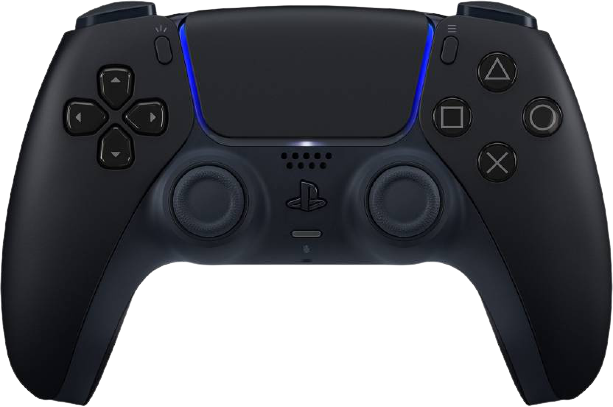
SONY
DualSense Gamepad
                        <-- Using the 'card card-ecom' class names -->


                        <div class="card card-ecom">
                            <div class="card-img-cont">
                                <img class="card-img" src="../assets/play.png" alt="ps5" />
                            </div>
                            <div class="card-badge">SALE</div>
                            <div class="card-body">
                                <div class="card-header">
                                <h6 class="card-title">SONY</h6>
                                <p class="card-desc">DualSense Gamepad</p>
                                <div class="card-price">
                                    <span class="price-new">Rs.4599</span>
                                    <span class="price-old">Rs.5999</span>
                                    <span class="discount">(24%)</span>
                                </div>
                                </div>
                                <div class="card-footer">
                                    <button class="btn btn-primary">ADD TO CART</button>
                                    <button class="btn btn-icon">
                                        <i class="bi bi-heart"></i>
                                    </button>
                                </div>
                            </div>
                        </div>
Horizontal Card
Just like vertical card it is a Horizontal version of product components. We can display products in both ways horizontally as well as vertically.
SONY
DualSense Gamepad
                        <-- Using the 'card card-ecom' class names -->
                        <-- Using the 'card-horiz' class for horizontally aligning -->


                        <div class="card card-ecom card-horiz">
                            <div class="card-img-cont">
                                <img class="card-img" src="../assets/play.png" alt="ps5" />
                            </div>
                            <div class="card-badge">SALE</div>
                            <div class="card-body">
                                <div class="card-header">
                                <h6 class="card-title">SONY</h6>
                                <p class="card-desc">DualSense Gamepad</p>
                                <div class="card-price">
                                    <span class="price-new">Rs.4599</span>
                                    <span class="price-old">Rs.5999</span>
                                    <span class="discount">(24%)</span>
                                </div>
                                </div>
                                <div class="card-footer">
                                    <button class="btn btn-primary">ADD TO CART</button>
                                    <button class="btn btn-icon">
                                        <i class="bi bi-heart"></i>
                                    </button>
                                </div>
                            </div>
                        </div>
Dismiss Card
Few components are just there on the UI to display some information once their work is done user can close these cards using dismiss button.
50% off on Gaming Headphones

                        <-- Using the 'card card-dismiss' class name -->


                        <div class="output-cont">
                            <div class="card card-dismiss">
                                <div class="card-body">
                                    <h3>50% off on Gaming Headphones</h3>
                                </div>
                                <div class="card-img-cont">
                                    <img class="card-img" src="../assets/headphones.svg" alt="ps5" />
                                </div>
                                <div class="card-close">
                                    <svg xmlns="http://www.w3.org/2000/svg"></svg>
                                </div>
                            </div>
                        </div>
Text Overlay Card
Text overlay cards are genrally those which has text on top of them in most of the cases the card just contains a background image and text on top of it.

New Gaming accessories available on sale.

Gaming consoles are back in stock. HURRY UP!!
                        <-- Using the 'card card-overlay' class name -->


                        <div class="card card-overlay">
                            <img class="card-img" src="../assets/overlay.jpeg" alt="ps5" />
                            <div class="card-body">
                                <h3 class="card-overlay-text">New Gaming accessories available on sale.</h3>
                                <button class="btn btn-secondary">SHOP NOW</button>
                            </div>
                        </div>